

Simplifying the hike selection process

AllTrails iOS mobile app usability case study
Problem
What are AllTrails’ current iOS mobile app usability issues? How might AllTrails simplify how users find hikes that fit their specific needs?
Role
As a product designer who loves hiking (not affiliated with AllTrails), I took on this personal project to improve the usability of AllTrails’ search and filtering process.
Scope
Research, Information Architecture, Ideation, Interaction, Visual Design, and Prototyping & Testing.
Project Outcomes
Using AllTrails’ current design guidelines, I implemented changes to reduce friction in the filtering process and redesigned the main list view to display more relevant information.


Approach

Users spent a lot of time searching for the right hike.
Usability testing
To discover pain points in the user experience of the AllTrails iOS mobile app, I used guerrilla usability testing at various coffee shops in San Francisco. I wanted to capture how people at various hiking levels would use and interact with the app so I was fairly broad when choosing people to interview. I interviewed five people in their 20s or 30s who were either avid or casual hikers and who had some affinity for the outdoors.
User tasks

Task 1: You and your friend who doesn’t hike often are going to Joshua Tree National Park. Use the app to choose a hike that you think both you and your friend would enjoy.
Task 2: You are visiting Point Reyes this weekend. Find a hike that is about 5-7 miles long and has moderate difficulty. Now share this hike with a friend.
Card sorting

During my user interviews, I discovered a major pain point around filtering. I used closed card sorting with 3 more users so I could hone in on the most important descriptors for hike selection.
Users ranked the 11 available filter categories in order from most to least important. All three ranked difficulty and length as the 2 most important categories. Elevation gain ranked in the top 4 for all users.
Synthesis and analysis
After reviewing my notes from user testing, I wrote each key frustration on a Post-It note and organized this into an affinity map.
After grouping the notes by key themes, I prioritized them based on the following factors:
Value to the user
Ease of implementation
Value to the business
This process allowed me to address the pain points that would result in the greatest impact to the business while solving key user experience issues.
Three pain points caused the most frustration for users.

Pain point 1: Main list view doesn’t display important metrics
3/5 users wanted to see length and elevation displayed for each hike in the main list view.
4/5 users felt that all of the images looked the same and would rather see more hikes before scrolling.
“I needed a break after just looking through the details for only one hike. I spent so much time just getting to that point.”
Pain point 2: Users have to exit the list view in order to filter
Users were constantly going back and forth between the filter screen and the list view screen. All of the users I tested were mostly interested in filtering only on difficulty, length, and elevation gain. However, once they got to the filters screen, they were confused by many of the advanced filters.
“I was frustrated that I wasn’t getting any filter results and would have closed the app at this point.”
Pain point 3: Filter options are overwhelming
There are 11 possible categories to filter on. All 5 users applied too many filters, resulting in few or zero hikes being displayed.
“Ending up with no trails found was a discouraging experience. I almost quit the app at that point.”

Task flow analysis
After identifying and prioritizing key pain points, I mapped out the task flow to identify the areas my changes would impact. These are denoted in red.

These frustrations could be addressed by redesigning two screens.
Main hike list screen
Filtering options screen
By addressing most users’ filtering needs in the hike list screen, I would be able to limit the need for users to ever visit the filtering options screen, which was overwhelming for all of my test subjects.
To find filtering components, I used Pttrns for inspiration, where I found Yelp and Aaptiv’s use of filters especially powerful.
Low-fidelity wireframes
For each of the two screens, I sketched out three potential solutions on a whiteboard.
I realized that I could leave the filtering screen mostly as is, as long as I optimized for filtering via the list view screen. This would result in most users visiting the advanced filters screen only if absolutely necessary. I focused most of my re-designs on the hike list screen, as I felt this was the most effective way to have the highest user impact.
Components that made it into my prototype are highlighted in green.
List view

Filtering view
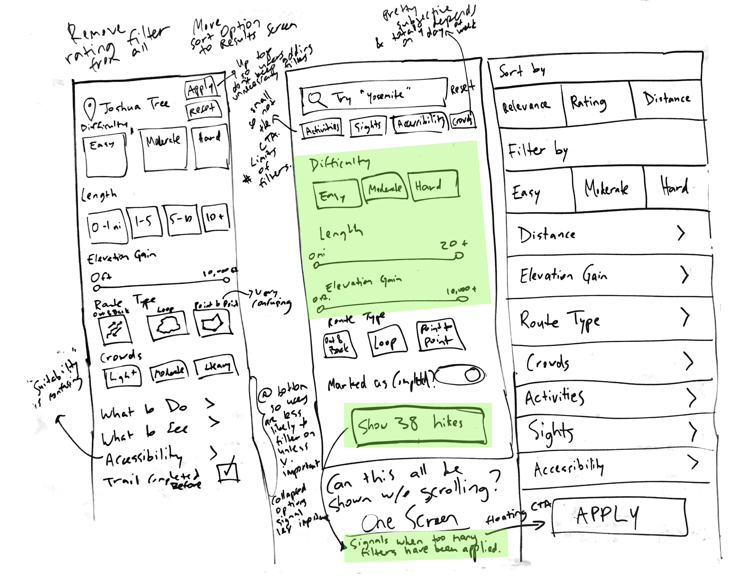
List view components

Investing more time on low-fidelity wireframes allowed me to rapidly prototype.

I used my wireframes to get feedback on my various redesigned components. Because I wasn’t changing the user flow itself, I didn’t do mid-fidelity wireframes.
Instead, I went straight into high-fidelity prototyping. I used Sketch to design new screens and created an Invision interactive prototype that I used to test, validate, and iterate on my changes.
Before and After
Redesigned main list view to show more content


Filtering from main list view


Simplified advanced filtering


Users validated that my changes improved task outcomes.

Key Learnings
Usability testing allowed me to go beyond my own biases and perceptions of the AllTrails app, since I am an avid user myself. I was able to test my own hypotheses in a way that gave me authentic, usable information that I could design solutions for.
I also saw firsthand how investing more time in low-fidelity wireframes allowed me to have a smoother process when building my prototype. It’s easy to de-prioritize lo-fi in order to get to visual design, but it’s important to make sure that the right amount of focus is given to both lo-fi and hi-fi work.